The Worst Online Giving Form I’ve Seen: Is It Yours?
Shopping cart abandonment is a problem for online retailers. We’ve all done it when shopping online. We select a few items, add them to our cart, and then something happens. Maybe it’s the price, we get distracted by something else, or we simply change our minds. Browser closed.
Whether you know it or not, the same scenario applies to nonprofit fundraising. You know the important role online giving plays in meeting your goals. But what if the very way you get these donations is the cause of abandonment?
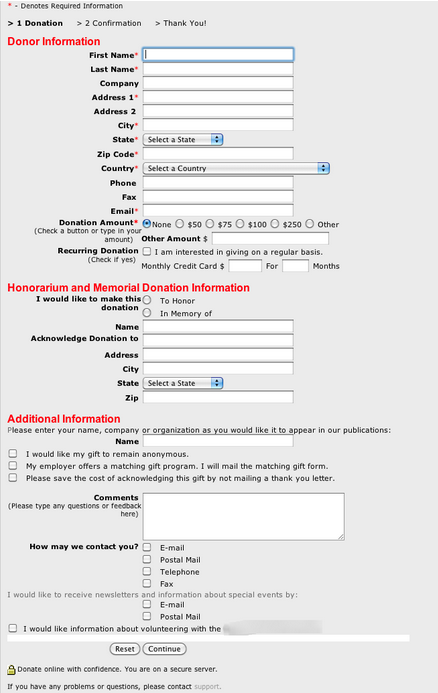
I’m talking about your online donation form. Chances are, it’s hideous, it’s clunky, and it’s driving away potential donors. With that in mind, I present to you The Worst Online Giving Form I’ve Ever Seen. I hope it’s not yours.

Online Giving Forms Gone Wrong
Bear in mind I’m using this as an example — not to belittle the organization, but to help educate. This post is intended to illustrate a major problem nonprofits face with online giving, and offer solutions.
Let’s break this form down so we can understand what’s going on from a donor’s perspective.
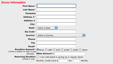
Donor Information

Donors must fill out all their contact information each and every time they want to make a gift. That’s eight fields at a minimum. Then they select their donation amount and indicate if they would like to set up recurring giving.
Honorarium and Memorial Donation Information

This is fine on the surface. It’s common practice for charities and places of worship to offer honorary and memorial giving. But what’s with the address form? The fields aren’t marked as required, but they sure seem compulsory.
And why does this organization need all of that information? None of this is explained at all.
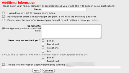
Additional Information

Now your donor is presented with even more text fields and checkboxes. Anonymous gift, mailing a matching gift form, comments, and selecting how this organization may contact them. Oh, and would they like to volunteer?
Continue
But wait, there’s more! In case you didn’t catch on already or notice the dead giveaway at the top of the form, they haven’t even been asked to provide a method of payment yet. That’s right, it’s onto page two. Two. Pages. How long have they been sitting there already and you still haven’t collected a plugged nickel?
I’m Out of Here
I don’t know about you, but there is nothing about this form that would make me go through all those steps and type in all that information to make an online donation. If I did, I guarantee you I would only do it once.
But frankly, I would take one look at this beast and close my browser tab. And in today’s world where we expect our online experiences to be quick and easy, I’m willing to bet you would too.
A study by the Nielson Norman Group, a world leader in usability and user experience, suggests that fixing even minor usability problems with online giving forms could increase donations by 10%. This is no small feat, and I honestly believe that number is conservative.
It’s Not Your Fault
Most nonprofits are small operations, often lacking the financial, technical, and human resources to invest significant effort into their online fundraising activity. Maybe your organization has the resources but you don’t know where to start.
And there is a slew of companies trying to sell you on this solution or that one until it all becomes a blur of feature/benefit statements.
So what do you do? You go look at some of the online giving options offered by the larger charities for guidance. They have slick-looking landing pages, sometimes with embedded video, and short forms with clear explanations and calls to action. Their online donation forms look, in a word, expensive.
There’s Hope…and Help
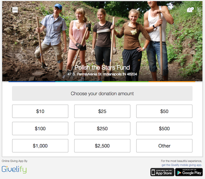
Givelify is known for providing a beautiful giving experience through our mobile donation app. Almost 10,000 organizations agree and have moved on to the next generation of giving. But did you know you can bring this same experience to your donors who give online?
Think back on the form we dissected above. Now look at this:

When giving is this elegantly simple, your members will be more passionate and generous in their stewardship. Bringing the same philosophy of beauty and simplicity from our mobile app to online donations ensures your electronic donations will increase.
Recommended for you:
- [Free Webinar on March 9, 2023] Maximize Easter Generosity: Turn One-Time Givers into Year-Long Supporters
- Video: Happy Anniversary to Our Giving Community
- 7 Ways to Celebrate Be Kind to Humankind Week
- Video: Street artists in Mexico spark candid conversations about breast cancer
- Celebrating Black Philanthropy Month Every Day


